It has been almost 2 weeks on Omnipod 5, so I wanted to give you a short update with some data that is intentionally sparse on deep thoughts, animal analogies, and censored swearing.
All of these screenshots are from Glooko, which is both free and automatic to use with Omnipod 5. The controller has a SIM card for AT&T at no cost to the patient to upload throughout the day even when not on wifi. Glooko is delayed by about an hour, so you can't use it for real-time alerts and tracking, but it does a very nice job for reports.
I have installed a bridge plugin to sync Glooko data to Nightscout, but it still has the delay and feels like doing extra work just for the sake of doing extra work.
Loop Dev 1 Week Report
This first screenshot is Loop Dev with Dash from 2 weeks prior to starting Omnipod 5. If you remember the pod-on-the-back story...well that also turned into a 103 degree fever on day 1 of Omnipod 5. So I didn't want those few days on both sides of the switch to skew the data.

Omnipod 5 1 Week Report
This screenshot is a full week on Omnipod 5. They look eerily similar for TIR but you'll notice that Standard Deviation (SD) has improved by 20% and the extreme highs and lows also are closer to range.

Manual Interventions
A significant factor for this comparison is the number of manual tasks. This has a direct correlation to burden, burnout, and a teen's ability to manage independently. As you can see in the chart below, the difference here is staggering considering both achieved nearly identical results.
Boluses and Corrections includes meal boluses, high correction boluses, and high overrides (Loop only feature).
Carb Entries includes the initial carb entries in both systems and editing past carb entries (Loop only feature).
Low treatments includes consuming carbs for a low, low overrides (Loop Only feature), activity mode when used like a Loop override (Omnipod 5 only feature).

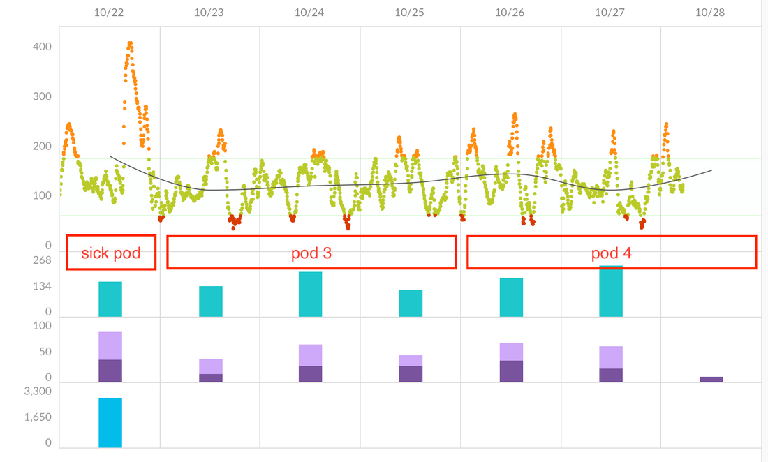
Thirty Day Report
And lastly, this is a 30 day graph from Glooko, which is one of my favorites to easily see weeks at time. I have added the black marker lines at 200, 250, and 300 for easier comparison. The carb and insulin rows indicate when Omnipod 5 started. In my above graphs, I intentionally skipped the few days right at the switch because of the failed pod and sickness which you can see clearly in this graph as the several days of very high BGs.
It only takes a quick glance to tell that Omnipod 5 has reduced the drastic highs substantially and has slightly less lows.

1 comment
Thank you for taking the time to write about Omnipod 5 (O5) versus Loop. My son used Loop for many years and I got burned out by all the manual interventions (a metric that is often overlooked). I see that one of the goals of your Loop patches is to reduce the number of manual interventions. If your time permits, it would be super helpful to have more details on your teenager’s transition from Loop to O5. O5 is largely a blackbox and there transition for my son was challenging w.r.t to settings. After a couple of months, we had O5 running reasonably well but he suddenly got quite sensitive to insulin and O5 went wonky so I discontinued it.